Alright, thank you to everyone who participated in this contest! I have selected my five favorite submissions, and now its time for you, the readers, to vote on which will be used in the final version of LA3D!
I know which one I would like to use, but I would rather base the decision on the views of the players, not just one person.
So here you go, listed in no particular order, find the Entry you like best and vote in the poll to the right!
Entry 1 by Nils:

Entry 2 by Roland:

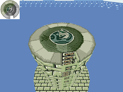
Entry 3 by Paolo:

Entry 4 by Mr. Burgundy:

Entry 5 by Katie:
Again, thank you every one who submitted an entry, you all put a lot of work into you're textures.
I know which one I would like to use, but I would rather base the decision on the views of the players, not just one person.
So here you go, listed in no particular order, find the Entry you like best and vote in the poll to the right!
Entry 1 by Nils:

Entry 2 by Roland:

Entry 3 by Paolo:

Entry 4 by Mr. Burgundy:

Entry 5 by Katie:

Again, thank you every one who submitted an entry, you all put a lot of work into you're textures.


22 comments:
Entry 3 all the way!
I voted for Entry1, but Entry 3 is fine too.
It's funny how Entry2 is winning, while imho it is decidedly the worst...
i voted number 3, fits best by the overall style of the tower
Darn I totally forgot about this. I was gonna make one too D:
However, Paolo managed to make basically what I wanted to do with his entry 3, so that's awesome :D
also, entry 2 having as many votes as entry 3? That's pretty surprising, as it's.. pretty bad imo :V unfitting in SO many ways
Weill, Entry 2 is....well, different LOL....I like entry 3 though, c'mon!!!
Entry 3 is clearly better, it's the only one that totally fits the style of the entire tower.
But 2 is winning because it's an anonymous poll and when people can vote anonymously they choose the stupidest option.
So I say only count opinions in comments, not votes in anonymous polls. Otherwise the griefers win.
I like entry 3 because it matches the tower design. Entry 2 looks horrible.
I votet for entry 3 and i can say, entry 2 cant be the winner of this Contest, i dont know why such so much people vote for this. But #5 is not bad at all...
Definitely entry 3.
I like entry 1.
Because it's Eagle's Tower rather than Tower of Windfish.
Number 3 :D
Will everyone just shut up about Entry 2....it might not be the best ever, but it's not like Entry 3 is all that great itself.
Why are people still voting for number 2? It looks terrible and doesn't match in the slightest.
Entry 1 is a cool idea but it isn't nearly detailed enough.
Entry 2 is funny
Entry 3 is nice and basic. It's simple but it works. However something a little more complex would be awesome...
Entry 4 is really out of place. It's cool but it doesn't really fit.
Entry 5 is awesome. It's complex and has a nifty design. I'd darken the edges a little so that they're the same shade as the bricks.
Entry five! It's taken a new spin on the traditional Wind Fish design.
Entry one is cool, but it doesn't seem like there's enough detail. Points for having an actual Eagle though.
O_o I don't understand Entry 2...what does it have to do with anything?
Entry three is pretty traditional. It looks like the rest of the tower, but I dunno...it's pretty bland for a final boss, IMO.
Entry four is cool, but like with entry 1 it could use more detail.
Entry 5 is interesting. Retro pixeling style, sort of. It might have been better if the outside stones were more like 3's, so they actually looked 3D, instead of using checkerboard shading.
Hah, I'm curious, even if it isn't mine: Mithos, which one did you like best?
I will give answers as to why I chose each finalist, and which was my favorite, once the poll ends. :)
Entry 2 is winning...I honestly think whoever created it is proxy voting it to infinity
ENTRY 5555555
Entry 3, please!! It's perfect to the compared the other entrys.
Number 3, number 3!! It's perfect!!
Post a Comment